
The safest QR code color pattern uses dark modules on a light, plain background with generous contrast. Color itself is not forbidden: navy, purple, green, red, and other sufficiently dark hues can scan. The risky choices are weak luminance separation, busy or transparent backgrounds, and inverted designs that depend on a scanner recognizing light modules on dark. Use the CraftMyQR generator to build the actual palette, then test the exported code rather than relying on a color name.
Most color guides repeat “use high contrast” and “avoid inversion.” Those are useful baselines, but they leave two questions unanswered: does a familiar web contrast ratio predict every QR result, and is an inverted code failing because of contrast or because the decoder never tries inversion? CraftMyQR ran a controlled test to separate those variables.
QR Code Color Rules That Hold Up
Use these rules before experimenting:
A managed destination can also help. Shorter encoded data often produces fewer modules, leaving more pixels or print dots per module at a fixed outer size. The dynamic QR code workflow is useful when the destination must remain editable and the encoded redirect can stay concise.
- Keep modules darker than the background.
- Preserve a uniform four-module quiet zone in the background color.
- Avoid gradients through finder patterns and other critical regions.
- Do not place a transparent code over photography without a solid backing.
- Test the smallest final size after every export, compression, and print transformation.
- Treat an inverted colored QR code as a compatibility choice, not merely a high-contrast palette.
Contrast Is More Useful Than Color Names
“Red” is not one brightness. A deep burgundy on white may separate clearly, while a pale coral may not. Likewise, two colors that look different by hue can have similar relative luminance and merge when a camera converts the image to grayscale.
For the experiment, we computed WCAG relative-luminance contrast ratios. That formula gives a reproducible numeric description of light and dark separation. It is not a QR specification, and the familiar 4.5:1 text-accessibility threshold should not be promoted as a universal QR threshold. QR sampling, module size, color-channel processing, exposure, glare, and decoder preprocessing introduce different constraints.
The best colors for QR code design therefore cannot be selected from ratio alone. Contrast is a useful screening metric; exact-code testing remains the decision rule.
In other words, a QR code color choice needs both a measurable contrast ratio and a final-format scan. A branded QR code color may look distinct to a person while becoming less distinct after grayscale conversion, exposure changes, or printing.
Method You Can Reproduce
We generated the same Version 4, error-correction-level M URL for ten palettes. Keeping payload, version, module layout, and complete image size constant meant the foreground and background colors were the intended variable.
Each palette went through five deterministic image conditions: clean 260 pixels, reduced 170 pixels, JPEG quality 60, 0.75-pixel blur, and 35-degree horizontal foreshortening with light blur. We used jsQR 1.4.0 and ZXing 0.21.3 and required both decoders to return the exact original payload for a strict pass.
We ran two decoding modes. “Normal” used conventional dark-on-light processing. “Inversion-aware” enabled jsQR’s bidirectional attempt and retried ZXing with inverted luminance. This does not represent every phone camera. It isolates whether an explicit inversion path changes the outcome for the same pixels.
Results Across Ten Palettes
The conventional dark-on-light palettes retained full strict passes down to 3.19:1 in this specific set. Light gray at 2.52:1 dropped one condition. That does not establish 3:1 as a safe minimum: amber and gray differ in channel values, resampling behavior, and the exact thresholding choices inside each decoder.
The stronger information gain came from the inverted pairs. White on black had the maximum 21:1 contrast, yet normal decoding returned 0/5. The inversion-aware path returned 5/5. White on navy behaved the same way. High contrast was present in both cases; explicit inversion support was the missing capability.
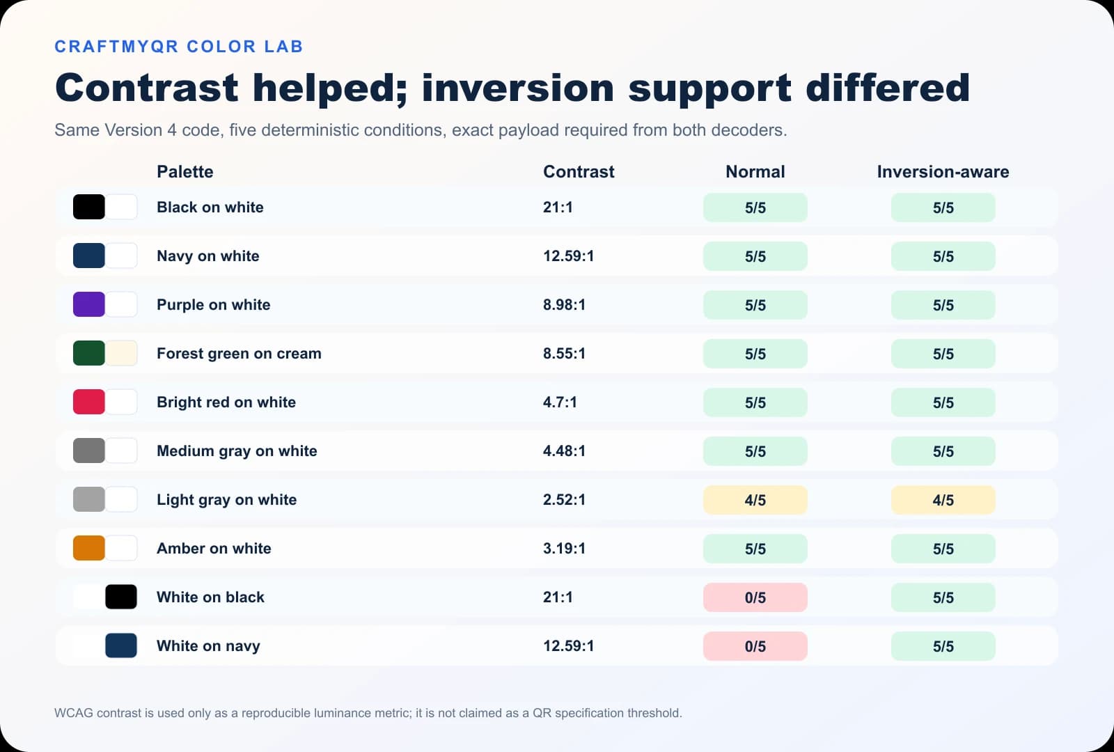
| Palette | Contrast ratio | Normal | Inversion-aware |
|---|---|---|---|
| Black on white | 21:1 | 5/5 | 5/5 |
| Navy on white | 12.59:1 | 5/5 | 5/5 |
| Purple on white | 8.98:1 | 5/5 | 5/5 |
| Forest green on cream | 8.55:1 | 5/5 | 5/5 |
| Bright red on white | 4.70:1 | 5/5 | 5/5 |
| Medium gray on white | 4.48:1 | 5/5 | 5/5 |
| Light gray on white | 2.52:1 | 4/5 | 4/5 |
| Amber on white | 3.19:1 | 5/5 | 5/5 |
| White on black | 21:1 | 0/5 | 5/5 |
| White on navy | 12.59:1 | 0/5 | 5/5 |
What These QR Code Colors Prove—and Do Not Prove
The test supports three conclusions:
It does not prove that every phone scans amber at 3.19:1 or that every inversion-aware app accepts reversed codes. Five deterministic conditions are not success probabilities. The render has no screen reflections, printer color shift, ink spread, autofocus hunting, white-balance error, display dimming, or tinted material.
The experiment also used solid fills. Gradients may create different effective contrast across modules, especially if a pale region crosses a finder pattern. Metallic inks and glossy laminates can change brightness with viewing angle. A brand palette that passes on a calibrated monitor may print differently on kraft paper or a translucent label.
- Dark colored modules can work when luminance separation remains strong.
- A single contrast ratio does not define every pass boundary.
- Inversion compatibility is separate from contrast quality.
Choose a Safer QR Code Color Palette
Start with a very light background and a dark brand color. If the brand hue is naturally bright, darken it for the modules rather than tinting the background until the pair barely separates.
A practical selection workflow is:
Black on white remains the most portable baseline because it gives exposure and printing processes the widest separation. Navy, dark green, deep purple, and dark red can retain much of that margin. Pale gray, yellow, light cyan, and pastel foregrounds usually spend it quickly.
- Convert the proposed colors to grayscale or inspect their relative luminance.
- Reject pairs that become difficult to distinguish at a glance.
- Keep the three finder patterns at least as dark as the rest of the modules.
- Preserve a plain quiet zone in the same light background.
- Export at the real dimensions and test the exact file.
- Print a proof on the actual substrate when the campaign is physical.
Why Inverted QR Codes Need Extra Caution
An inverted symbol uses light modules on a dark field. Some modern decoding pipelines detect and invert it; others search only for the conventional polarity or apply preprocessing that loses the pattern. Our two-mode result demonstrates that the pixels may be decodable while the normal path still rejects them.
If an inverted style is essential, provide a light panel around the complete code and test a wider device set. Do not confuse a decorative dark card with the symbol background: the quiet zone should still form a clear, consistent region around the code.
For a public campaign where you cannot control devices or apps, conventional polarity is the more dependable default. A short-lived event with staffed scanning and a specified app can accept more controlled design risk than packaging intended for years of consumer use.
Production Problems a Digital Test Cannot Model
Color management can move a passing design toward failure. CMYK conversion may make a bright red lighter than expected. Uncoated paper absorbs ink and softens module edges. A dark background can fill small light gaps. Screen brightness and night modes alter displayed contrast, while transparent overlays mix the code with whatever sits behind them.
Use the QR codes in print guide to check dimensions, material, and proofing. If an existing design fails, work through the QR code not scanning checklist rather than changing colors at random.
The final proof should include ordinary and dim light, straight and oblique approaches, minimum intended size, the longest intended distance, and multiple camera generations. Save the rendered campaign asset used in the test so later edits do not silently replace a proven palette.
A Decision Framework for Brand Teams
Choose the amount of color freedom according to who controls the scanner:
This framework adds operational context to the raw QR code contrast number. The less control you have over cameras, apps, lighting, and age of the asset, the more margin the design should preserve.
| Use case | Scanner control | Recommended color posture |
|---|---|---|
| Consumer packaging | Low | Conventional polarity, very high contrast |
| Posters and signage | Low | Dark brand modules, light solid background |
| Internal warehouse app | High | Validate palette against the specified app and devices |
| Staffed event | Medium to high | Controlled palette may work with on-site fallback |
| Digital campaign creative | Low | Test downloaded/compressed platform copies |
Conclusion: Treat Color as a Margin Decision
A dependable QR code color choice starts with dark modules, a light uniform background, a protected quiet zone, and final-format testing. The CraftMyQR QR code generator lets you create the actual colored code; the controlled results show which assumptions still need proof.
The key information gain is that contrast and inversion are not the same variable. High-contrast reversed designs failed the normal path but passed when inversion was explicitly attempted. Use color to support the brand, but keep conventional polarity for broad compatibility and let representative scans approve the final asset.
Frequently Asked Questions
Can a QR code be any color?
A QR code can use many dark foreground colors, but not every pairing is dependable. The modules must remain clearly darker than a plain background, and the exported or printed result needs testing at its real size and conditions.
What are the best colors for a QR code?
Black on white offers the widest conventional margin. Dark navy, green, purple, or red on white or a very light neutral can also work when contrast stays strong and the quiet zone remains clean.
Is a 4.5:1 contrast ratio enough for QR codes?
Not as a universal rule. That ratio comes from text-accessibility guidance, not the QR specification. It is useful for comparing luminance, but module size, polarity, printing, lighting, and decoder preprocessing can move the real boundary.
Can I use a gradient in a colored QR code?
You can test one, but gradients create different contrast across the symbol. Keep every region dark enough, avoid pale transitions through finder patterns, use a solid background, and verify the final compressed or printed asset on representative devices.
Why does a white QR code on black fail despite high contrast?
Some decoders search primarily for dark modules on a light field and never attempt polarity inversion. The pixels may contain adequate contrast, yet the processing path rejects them. Explicit inversion support can change the outcome.
Does a transparent QR code background work?
Transparency makes the effective background depend on the page, image, screen, or material underneath. Use a solid light backing that includes the quiet zone so the tested contrast remains stable wherever the code appears.
Will print colors match my screen test?
Not necessarily. CMYK conversion, paper color, ink absorption, lamination, and lighting can shift luminance and soften edges. Approve a physical proof on the actual substrate instead of relying only on the monitor preview.
Should finder patterns use a different color?
Keeping finder patterns at least as dark as the other modules is safer. Decorative multicolor finders may change detection behavior, so test the exact design broadly and avoid reducing their contrast for purely visual balance.
Need to create a QR code now?
Create and preview your QR code with our free generator. For long-term materials like menus, packaging and posters, consider upgrading to dynamic QR codes.